


It is often used for special editions of albums, or when it comes to DVD sets. Major record companies use them especially if their artist has a well-established fan base as they are more loyal, therefore more likely to purchase their albums.
 MeadWestvaco were the first to create Digipaks, it was
trademarked. But the format became increasingly popular, other companies and manufactures
started using it. Now, they are not uncommon or a surprise when they are used.
MeadWestvaco were the first to create Digipaks, it was
trademarked. But the format became increasingly popular, other companies and manufactures
started using it. Now, they are not uncommon or a surprise when they are used.  The digipak embodies the genre and feel of the artist. This
highlights the artist or band image, somewhat making them more popular with
their type of audience. People look at album overs and see where the artists’ inspiration
comes from, and they tend to feel like they can relate or connect to them. For
instance, if the digipak has a pop theme, then the colours would be bright and
bold.
The digipak embodies the genre and feel of the artist. This
highlights the artist or band image, somewhat making them more popular with
their type of audience. People look at album overs and see where the artists’ inspiration
comes from, and they tend to feel like they can relate or connect to them. For
instance, if the digipak has a pop theme, then the colours would be bright and
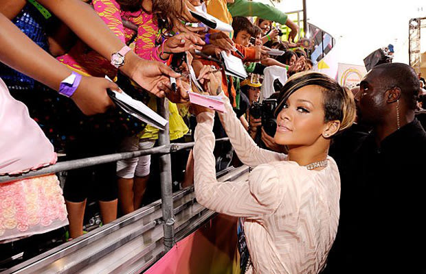
bold.The visuals will correlate with the cover. Rihanna’s “Loud,” album emphasises the colour, which suggests sexual themes, as well as love, and rebellion. Pop music commonly has these themes, which is exemplified through her album. This benefits the artist as it is used a way to promote them “artistically,” which helps encourages their audience to purchase it.
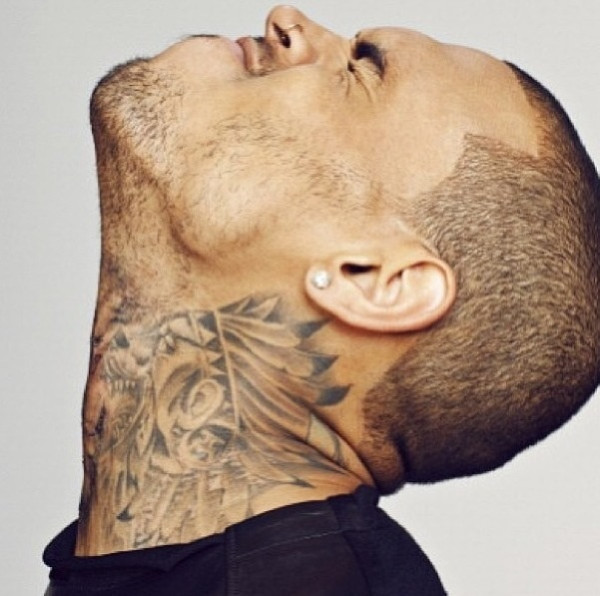
 The centre of the album is Chris Brown himself, thus addressing
the audience who he is. He is well known, and has a growing fan base, this is
effective as they can spot immediately Chris Brown.
The centre of the album is Chris Brown himself, thus addressing
the audience who he is. He is well known, and has a growing fan base, this is
effective as they can spot immediately Chris Brown.Brown's face is harsh, and intense, emphasising his masculinity. This conflicts with the title “fame,” suggesting, the fame has created this image of him. The graffiti style exemplifies urban culture.

The background is hard to grasp as it is rather chaotic. He is the main person in colour, suggesting he stand out in his genre. The colours are a mixture of soft, and harshness which demonstrates his colourful personality and how it ranges. This attracts the target audience which ranges from 15-26.

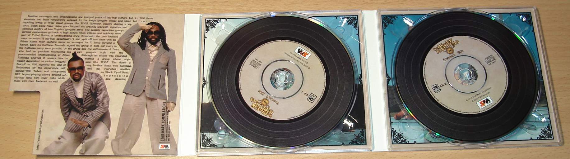
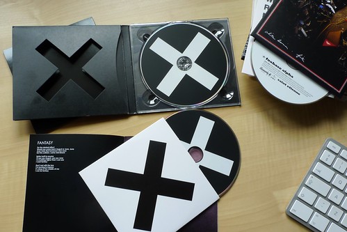
Other examples of Digipaks.


Initially, the idea revolves around the female protagonist is suppose to form a band, however it fails. The 1975 inspires us to do a photo shoot with her, and then photoshop him 4 times, or 3 times in the same places so it looks like he represents a full band although she's alone.

Initially, the idea of "The Ironics," is that the male protagonist is suppose to formulate a band, however it fails. This picture of the band, The 1975 inspires us to do a photo shoot with him, and then photoshop him 4 times, or 3 times in the same places so it looks like he represents a full band although he's alone.
The silhouette effect would emphasise how he is alone.
Here's another few pictures to show this.


This long shot could implicate how he walks the road to success alone. The blurred effect suggests how it is not clear where he could end up, but he is willing to explore.
Also, we could use the drawing effect on photoshop to make it look more authentic.


This "Pop art," look brightens the mood because although the song is upbeat, the style is still indie. Indie normally has the black and white theme, with bright and dull lights. It illustrates that the genre is not mainstream, and not of popular music.
No comments:
Post a Comment